

The Archibald is now finished, I managed to sneak in on the second last day and it was surprisingly empty. Not exactly empty but
deserted compared to the last time I tried to get in: where the line stretched from the foyer, past the gift shop and into the permanent collection.
These are my favourites of the show. Some didn't come out well enough, like Abbey
McCulloh's painting which was all about colour.
A couple others were from the Wynne Prize, I usually don't like landscape painting but that exhibition really took with me. Especially Paul Ryan's work, titled 'My home is the sea'. Loved the framing of the coastline, it was almost like a little boat, or a floating island, very insular and gorgeous. It actually reminds me of some of
Nicky O'Byrne's art. Paul's portrait 'Moutain of Tom' was also kick ass.
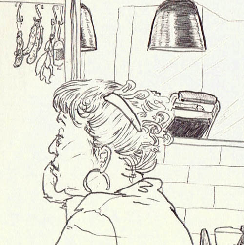
Sam Cranstoun's portrait was amazing, though I must admit I have a thing for hair now. I also feel I liked his work because all the facial hair reminded me of wolverine; my 2D childhood sweetheart.
And while I was drawing 'Gyton' I met Cathy Larsen, one of the design heads at Penguin books! It is great just randomly running into creative heavy weights. She was sweet and really friendly and gave me some advice on my illustrating dream.
(Cathy if you are reading this Thank You! also I think the paper person we were talking about was Nicholas Jones, shows at Pablo Fanque)
I seem to be having trouble opening the AGNSW website so here is a different link if you want to check out the
Arcibald Finalists.




 STPI is a famous printing studio/gallery/awesome place. This image wasn't in the main exhibition but I found it off to the side and was quite taken with it. For the techies out there it had shaped intaglio/etching plates, possibly printed twice, once with a colour roll and others with just etching or others with etching and aquatint. So there was a particular emboss on some image while others were on this massive bleedprint plate that were inked in different colours.


 A lot of people have issues with pigeons,
 After finding a few resource images I made a rough composition and continued to refine it until I was happy. Since it was a very complex image I did the first few sketches by hand but then surrendered to photoshop. I am very particular about composition so this was probably the longest-or at least the hardest-part of the process.
 Usually I know what 'style' or 'look' I am going for, and the composition follows this knowledge. But this time I didn't know if I wanted to go for a fairly realistic image or follow a style more derivative of children's illustrations. I did want a particularly happy perky image to off-set the horrible fact that children were obliviously swimming with crocodiles.
 I decided on the kid on the bottom right hand corner, watercolours with a pencil outline. I had originally wanted to screen print the image, but as the composition got more complicated and the costs started to count off in my head I decided to go with a more familiar medium. But with the strong pencil outline and the big washes of colour I felt like this style was close to my earlier idea.
 I tested a few images with this style and felt the water was looking crap. So in the end to get the right 'flatness' similiar to screen printing I used acrylics; and when that didn't work I used the computer. I showed the above image to the rest of the 'murderous crow' crowd and got some lovely feedback. Everyone felt it would work better if the crocodiles were less visible on first glance. (To get more of a 'Where's Wally' sort of effect) And I agreed with them completely. So after making my crocodiles much more green I did the final image.

 I have never gotten along very well with colour pencil. Even now I am not able to beat a 5 yr old on terms of shading and blending colours.
  Above is a 'final' drawing I made for Illustration Friday, the concept was "climbing". Sadly my computer imploded and I wasn't able to add on time. But I'm still glad I got off my ass and did some Illustrating.
  This is my final sketch for the concept, I kept pretty tight with this image. I particularly liked the pencilling and just tried to replicate the marks I made in this in the final.


